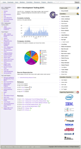
I recently blogged about some a new project summary page design that I’ve been tinkering with. Here’s what it looks like:
The page is entirely data-driven from project metadata.
The title comes from the projectname metadata entry; if this entry is not specified, the value is obtained from the projects database that I maintain (so you can override the value, or remain at my mercy).
The description comes from a file provided by the project and referenced by the descriptionurl metadata entry. Since a lot of projects do a rather poor job of specifying this value (many just stuff a link to their project home page), I try really hard to scavenge a useful value. By simply providing a link to a reasonable file, this part of the page can look pretty sharp. For what it’s worth, having the description in a file outside of the portal was, in my opinion, a bad design decision. The logo comes from the logourl metadata entry. It’s only displayed if it is actually provided.
Commits activity is generated from Dash data. It is only displayed if information is available. Dash uses the sourcerepository entries provided in the portal to do its work. The graph–generated using Google Charts APIs–is only as good as the data available. Again, I’ve found that I’ve had to be very robust in how I translate the repository information provided in the portal as some committers have difficulty getting the URL form right (though, I’m pretty sure that–while visually unappealing–the instructions in the portal are pretty clear).
Company Activity provides a different view of the same Dash data and depends on the same metadata entries. This pie chart–also from Google Charts–shows the relative contributions from the various companies that contribute development resources to the project. Only those companies that have contributed a least one commit in the last three months are displayed. I decided to keep in “individual” since we have several projects that are driven almost entirely by individual committers that I felt needed to represented. Note that this information is generated weekly. I’ve been thinking of moving a smaller version of this pie chart into the “Supporting Organizations” section on the right navigation bar.
The Source Repositories section lists the repositories specified in the sourcerepositories metadata entry. This section provides handy links to the actual repositories.
The Releases section is built from the release metadata entries. I only display the information that’s provided. There are sub-entries that capture things like “new and noteworthy” documents, IP Logs, plans, etc. One of the things I need to do is provide linkage from each release to the corresponding review entry (unfortunately, due to the way that the information is captured and represented, this is relatively hard). Note that releases are sorted by date and only the most recent five entries are displayed. I need to add the ability to see the entire release history.
The Reviews section is also built from project metadata, but it is metadata that I maintain. Only the top seven entries are displayed; again, I need to add the ability to see the entire review history.
The left side of the page provides useful project information harvested from other metadata entries (like the wikiurl some handy navigation through the project hierarchy. I’ve been finding it useful for scanning through the projects; it may become a handy way for the community to browse the projects and find out more information.
The right side displays information about the people involved in the project. Bold entries indicate project-specific activity within the last three months. Similarly, the list of supporting organizations contains only those projects who have had at least one committer make at least one commit in the last three months.
At some point in the near future, I’m going to flip the switch and make this replace the existing project summary pages (which, frankly, are looking a little long-in-the-tooth). Some projects may opt to just use these pages in place of a Phoenix-based project website (let me know if you want to do this). Ultimately, this exercise has helped me to identify those entries in the metadata that are actually useful. That will be helpful information to take forward as we embark on a redesign of the Developer Portal. More on that soon…


