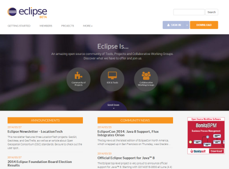
As with all good things, the time has come to give the eclipse.org web site a new look and feel. A lot has changed since the existing web site was launched over 5 years ago. Eclipse itself has evolved to bea large community of open source projects. The Eclipse Working Groups, ex. LocationTech, IoT, PolarSys and Automotive, have become important parts of the Eclipse community. The technology for building web sites has also changed significantly, with frameworks like Bootstrap and JQuery, becoming very popular.
Given this background, today we are making available a prototype of the new site. Our goal is to solicit feedback on the prototype before we make the big change in early June. The prototype is focus on the key pages of the site, including the home page and download page. We also worked on the header, footer and navigation menus. We did not work on the individual project pages but the expectation is that they will be able to move relatively easily to the new theme.

When we started we set out some goals for the new design:
- Make the site look nicer, ie. reduce some of the clutter, be more consistent with colours, etc.
- The web site should be responsive so it is usable on mobile devices.
- Make it easier for newcomers to get started at Eclipse.
- Help people discover and understand our Eclipse Working Group
To achieve these goals we put ogether a team of people to help design and advise on the new site. Chris Aniszczyk and Sven Efftinge provided feedback and advice from the committer/project perspective. Nitin Dahyabhai and Russ Bateman helped provide the perspective of the newcomer to the Eclipse community. Finally, Christopher Guindon, Denis Roy, myself and Matt Joanisse, a graphic designer hired by the Foundation to work on the site, worked on the design, content and implementation. I’d like to thank all of these people for spending the time helping get us to this stage.
As I mentioned, now we would like to get feedback on the prototype from the community. In particular, we would like to know the following:
- Overall, what is your view of the site? We have started a survey to solicit your feedback.
- Have we missed some key content that should be referenced from the navigation menu or from the key landing pages?
- Is the Getting Started Page missing any important content you think newcomers would find useful?
Please provide the feedback via this survey. As with any creative initiative, we guarantee we will read all feedback but we might not agree to implement it. 
We know the prototype is not complete. We still need to implement the design for mobile devices. There are a number of pages that still need to be implemented with the new design. Some of the links are not correct or aren’t pointing to a page. These will certainly be done before the site is launched.
Overall, I am thrilled with the new design. I can’t wait to see it implemented on the live site. A huge thank you to Christopher, Matt and the entire team for getting us to this stage.
